Lehman College Art Gallery | City University of New York
October 8, 2013 – January 8, 2014
Opening reception: October 21, 2014 6-8 pm
Talk by a master printer: October 22, 6 – 7:15 pm
Ghada Amer and Reza Farkhondeh | Yael Brotman | Melissa Brown | Lesley Dill | Rosemarie Fiore | Scherezade Garcia | Jane Hammond | Valerie Hammond | Beryl Korot | Joyce Kozloff | Nicola Lopez | Marie Lorenz | Whitfield Lovell | Tammy Nguyen | Jill Parisi | Elaine Reichek | Alexander Ross | Jens Schubert | Jean Shin | James Siena | Gary Simmons | Jeremy Coleman Smith | Josh Smith | Kiki Smith | Rob Swainston | Sarah Sze | Randy Wray | Andrea Zittel
This project is co-curated by Susan Hoeltzel and Yuneikys Villalonga
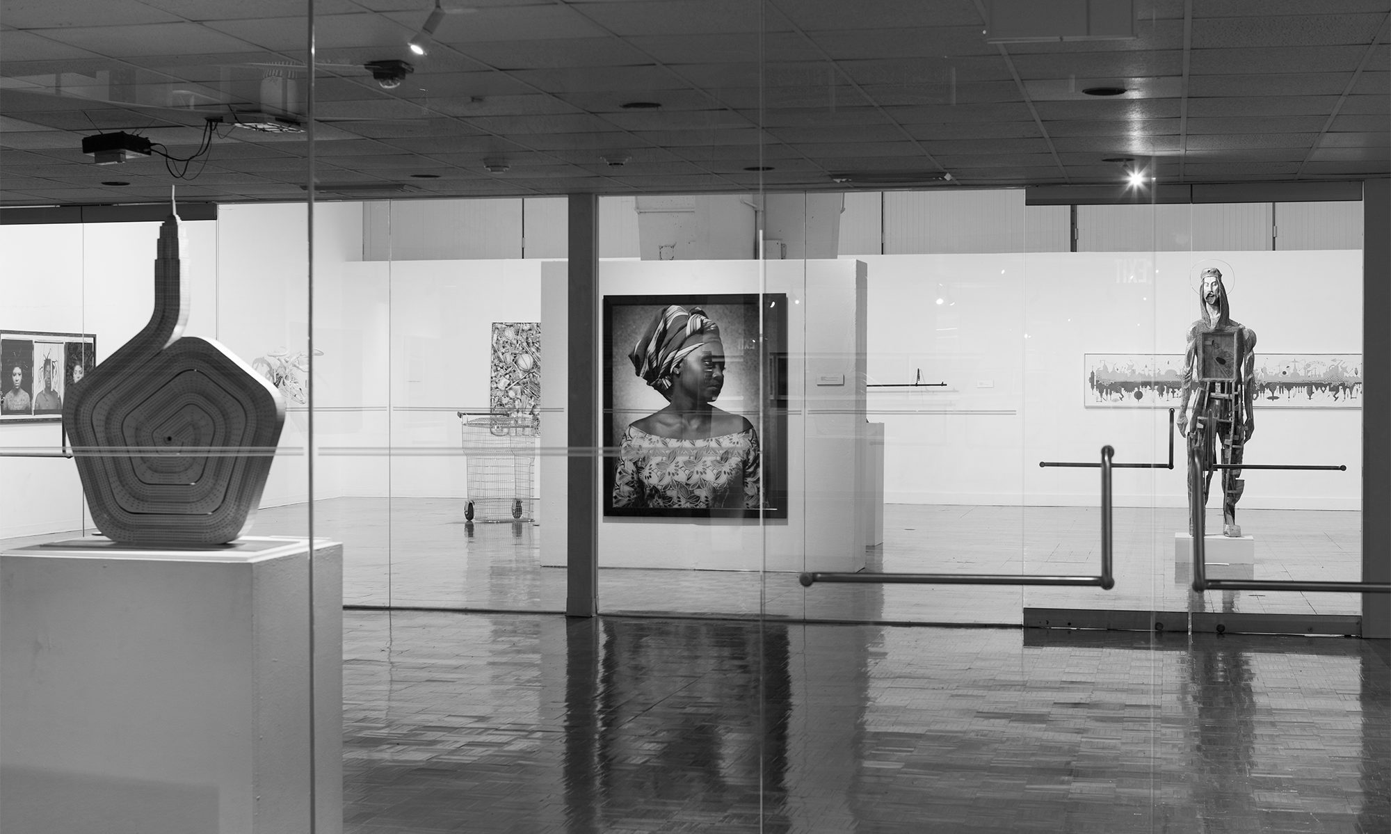
Morphology of the Print examines the form and structure of contemporary printmaking. The exhibition includes the work of 29 artists, both established and emerging, who push the boundaries of the medium and explore its strategies and techniques in new ways. Artists’ books, sculptures, assemblages, and installations are exhibited alongside two-dimensional work. The works blend a wide variety of traditional printing techniques with experimental approaches.
Jeremy Smith’s Fabricated Image / Reflective Space (2013), is an installation of a life-size domestic setting — a living room — where both walls and furniture are made out of paper. Three walls with floor give room to an elaborate wingback armchair, a lamp, faux porcelain plates, and wallpaper. The outside walls are printed with cedar boards to suggest clapboard. Smith focuses on intimate spaces to investigate people’s choices and tastes. Rob Swainston’s large-scale print installation also establishes a dialogue with architecture, this time by calling attention to the dramatic spaces of the gallery’s Marcel Breuer building. His grid-based work richly layers printmaking techniques. It is 18 feet high then extends out from the wall for another 5 feet, and repeats the angle of Breuer’s modernist ceiling of hyperbolic paraboloids. The title, A New System Every Monday, alludes to Breuer’s response to the charge of repeating himself — “I can’t design a whole new system every Monday morning”.
On a much smaller scale, Yael Brotman’s three-dimensional print whimsically interprets a utilitarian object — the Teardrop V, a compact camper trailor that first was popularized in the 1930s. Brotman’s trailors are an homage to the North American urge to explore the land and her childhood travels with her family, as well as, an acknowledgement of the aerodynamic designs of that era and the notions of modernism they embodied.
Sea of Wonder (2010-11), is part of Sherezade Garcia’s series Theories on Freedom. Silkscreen panels in different shapes are superimposed along the wall, to create a huge, gray sea filled with waves. For Garcia, the sea is a metaphor for freedom and for human migrations. It reflects the transience of life.
Jill Parisi’s grouping, Radiolaria (2005 – present), offers hand-colored etchings that draw inspiration from botanical and zoological species. Her bowl-shaped, translucent paper shells are also pyrographed, a method she uses to burn the paper, adding a delicate lacy quality to the prints.
Some artists find non-traditional techniques for transferring images, other than the printing press. Paper Fortune Teller (2009), by Melissa Brown is a woodcut on hand-dyed paper with stencil and metal leaf, printed using a construction steamroller. It is part of a group of work in which she references currency, lottery tickets and fortune telling and, in this instance is based on the children’s folded paper game. Her imagery and process are imbued with a subtle humor. Fireworks and colored smoke, an indirect printing process in itself, have long been a basic material for Rosemarie Fiore’s work. Her print in the exhibition Smoke Painting Monotype #5 (2012), was created by using a smoke painting machine, devised by Fiore, with the addition of hand-cut stencils that are inked and printed as monotypes.
Marie Lorenz’s works in this exhibition use less conventional printing blocks. Her work has focused on New York’s waterways since 2002 — she has offered a waterline perspective of the city with tours in a boat she built, as well as, documented objects that are carried by the tides, using printing, casting, and video. Her two large-scale prints examine this flotsam, pulled from the water, inked, and printed in a press.
Several artists combine stitching techniques with printmaking. Ghada Amer is known for her delicate line drawings of abstracted erotic subjects modulated by an overlay of stitched lines. Sewing has been a part of Amer’s work for many years and here it is added to the print with a digital sewing process. More recently a colleague, Reza Farkhondeh, has become a frequent collaborator and the two have produced Dalliances (2005), a lithograph
with floral patterns created by Farkhondeh and a figurative image by Amer. And We Move (Pause)(2008), by Jean Shin, is a cotton fabric print with digitized embroidery. A close-up of an orchestra conductor’s suit, as he conducts Ma Vlast (My Country), a piece by Czech composer Bedrich Smetana. The image creates an overall black composition with the musical score forming a narrow band at the bottom. Sound waves have been sewn into the fabric. Here Shin attempts to represent the nature of music. “And We Move” is a phrase often used by conductors to let the orchestra know they should start playing.
Beryl Korot’s two prints Weaver’s Notation – Variation 1 (2012), and Weaver’s Notation
Variation 2 (2012), revisit the intricate geometric patterning of her landmark video installation, Text and Commentary (1977). The earlier work explored the parallels between the coded information systems of video technology and the loom. In her recent prints she adds digital embroidery as a literal reference to both weaving and pixel patterns. Elaine Reichek’s print looks at a conversation between Ezra Pound and his soon to be wife Dorothy Shakespear from 1913. The dialogue is an exchange on the subject of embroidery in which Pound encourages Shakespear to put her efforts into something more meaningful than sewing — such as painting. Certain words are highlighted with digital embroidery and pieced in place, drawing attention to the language.
In Sarah Sze’s silkscreen Eyechart (2012), precisely cut letters pop out of the paper to stand vertically. She includes only the symmetrical letters of the alphabet. Dramatic shadows further define the shapes. The work conveys the artist’s concerns with perception and representation of space.
Tammy Nguyen and Lesley Dill have created artist’s books. Dill’s The Thrill Came Slowly (1996), is the result of multiple processes and techniques. Printed on Japanese silk tissue from photopolymer plates, it is later hand-sewed and wired. Dill uses an ink-solvent mixture, and Shellac allows her to enhance the half-tone images. As in most of her work, the text and image work together. Nguyen’s book is in the shape of a child wearing a hooded jacket. The arms and eyes open to reveal a narrative rendered in text and images. The story is that of a young girl who is born of an owl and a hawk.
Joyce Kozloff’s lithograph Now, Voyager I (2007), is a circular composition in the same fashion as her large-scale tondi. Elaborate constellations are delineated over a dark indigo background. They are drawn from the imagery used in seventeenth-century maps of the heavens. Glitter adds a subtle shimmer, resembling stars.
Valerie Hammond’s Apports (2012), is a photogravure. The title suggests a paranormal occurrence and loosely recalls the era of Victorian “ghost” photography, spiritualism, and séances. A central figure, artist Kiki Smith’s back, glows like a photo negative against a black background. In a closely related vein, Spell, an etching from Kiki Smith’s
(2011), Charm portfolio of nine etchings, deals with magic. Hand-colored Prismacolor pencil marks sparkle and move though the air like fireflies around a light bulb. The delicate lines of this small etching create a frisson and suggest the magic of an incantation.
In Patience (2001), Jane Hammond combines a range of techniques, such as iris print, relief, collage, and hand coloring. This work is one in a series where she uses the same background composition — an old TV showing a body of water in front of a landscape with vegetation and mountains. Flat, floating figures drawn from popular culture and the mass media are mixed and matched on top of the water — this technique is a signature of the artist who, for a long time, only worked with a reduced group of images over and over again. In this case, a yellow horse carries on its back a basket with barely recognizable elements, and a lighted candle comes out of the water creating an improbable, surreal scene.
Barbados (2009), and Georgia (2009), are lithograph and collaged prints by Whitfield Lovell. Being part of the same series, these works share a similar structure: they are narrow, vertical paper panels rolled in the upper and lower ends. Floral patterns in pale, pastel colors recall early 20th century wallpaper decoration. Inset into the wallpaper is a “found” vintage portrait of a woman suggesting a time, a place, and a life. The titles, Georgia and Barbados, allude to Lovell’s family’s origins.
Nicola Lopez’s Fire (2008), is one in a series of works that relate the urban landscape to the four elements — earth, water, fire and air. In a multiplicity of media — etching, carborundum, collagraph, and collage — Lopez depicts geometric fragments of architecture amongst a bright red and yellow fire. One of them falls out of the paper and lays beside it in a smaller, rectangular frame. To many viewers, it recalls September 11th.
Starlite Theatre (2012), part of Gary Simmons’ drive-in movie series, features the marquee of Dallas’s Starlite drive-in as an aquatint. The print reflects Simmons’ familiar “erasure” technique (originally based on partially erased blackboard images). It also demonstrates his interest in conveying more than the image might initially suggest — the Starlite was one of the few Texas theaters to accept African-American patrons in the segregated 1950s. Similarly, Andrea Zittel’s Sprawl 1 (2012), based on satellite views of the Southwestern desert, documents rapid human encroachment in the area. It is a large-scale lithograph created by matching and mirroring the original print sixteen times. These seductive abstracted views almost suggest a digitized Navaho blanket pattern while commenting on the effects of urban sprawl and its impact on the environment.
Untitled (2001), is a lithograph with stenciled acrylic by Alexander Ross. The image is a totem-like, organic structure that resembles a conglomeration of cells. Mainly a painter, Ross’s process involves building the actual figures in plasticine, digitizing them, and modifying them in the computer, to create their final appearance. In this way, two-dimensional works — paintings or prints — are granted a sculptural feeling. A similar process is that of Randy Wray’s, an artist who works in a variety of media, from sculpture to photography and painting. The series of Ickybana Offerings started as a set of different sculptures, which Wray would photograph and manipulate digitally before the printing processes and hand additions. Ickybana Offering (#30) (2007), is a silkscreen in 6 colors with glitter, offset lithograph and hand additions in pencil and ink. The title refers to the Japanese tradition of flower arrangements that, in the sixth century had a ritual, religious purpose and has evolved to the present as minimal arrangements of natural elements.
Josh Smith’s works in the show are monotypes printed with lithographic inks. In the color range of blues and browns, traces in the composition resemble the thick brush strokes of a painting. The titles — Abstract Print II (WHE-JS45) and Abstract Print III (WHE-JS50) — are not only descriptive of the works’ overall abstract nature, but they suggest the serial numbers that could have been used to archive them as mere objects.
Untitled (Iterative Grid Second Version) (2010), a hard-ground etching by James Siena, is an abstract composition of subtle, geometric lines that form rectangles and triangles. There are areas where these shapes are more concentrated than others, and smaller shapes are contained within bigger ones. As in many of Siena’s works, the image appears to have been computer-generated. In fact, this artist is interested in translating algorithms and equations into images.
Seven Halls: Lichtenstein (2012), is a unique linocut by Jens Schubert. This artist draws inspiration from varied cultural sources including pop culture, street signs, ancient masks, and futuristic helmets, to create new hybrids. Layers of pigment juxtapose one another to create intricate textures. The overall composition of vibrant colors and geometric shapes communicate dynamism.
The prints in this exhibition expand the vocabulary of traditional printmaking practice. They place this medium in the center of contemporary artistic experimentation.